PATREON
BRAND REFRESH

Patreon’s brand was stripping away the color and humanity of their greatest asset, creators.
Our first step was to reintroduce full color to every creator image to showcase their true creativity and spirit.


New Brand Book
We looked at every aspect of our brand, and systematically added back the creative spirit that was so lacking.
We drafted a set of easy to understand design principles that helped shape the rest of our brand book. These four simple rules established the framework for the rest of our brand work.


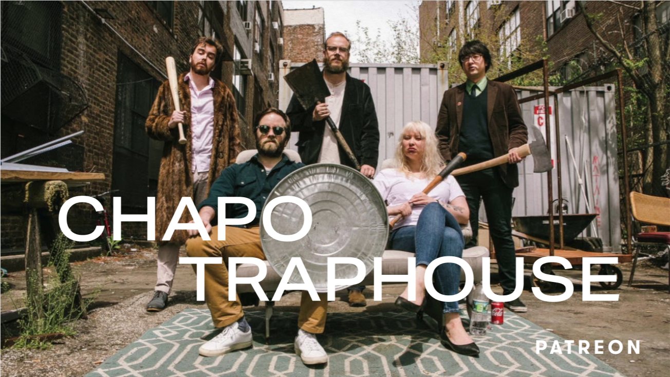
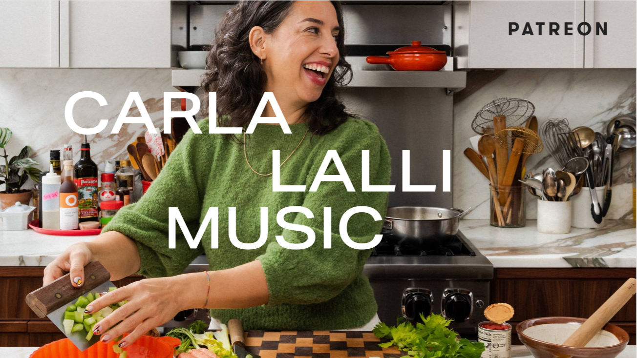
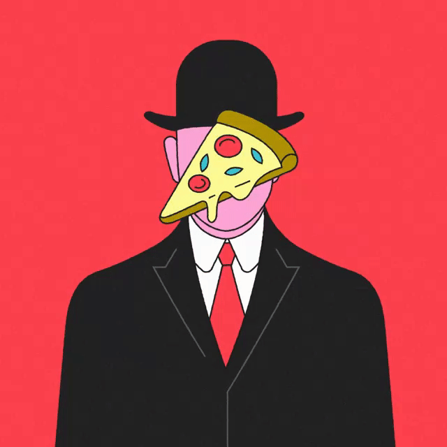
Content is bright, alive and as dynamic as our creators.

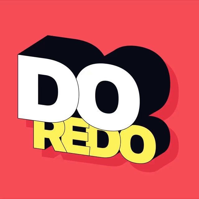
Finally, we added a layer of playful animation to capture the spirit of creativity and fun for the brand.